Ace the Lighthouse Audit: Best Practices for Consistent Interactivity
by Katie Huston | Last Updated: May 3, 2018
by Katie Huston | Last Updated: May 3, 2018
 First Interactive
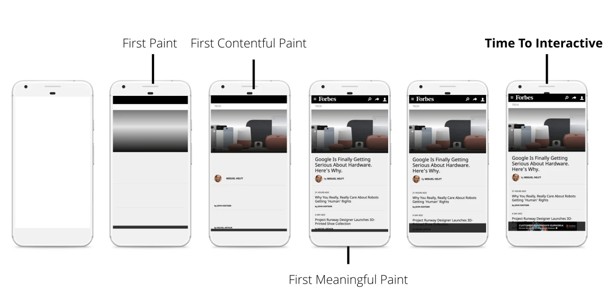
First interactive tells you that the following happens on your web page: 1) Most of the user interface elements on the page are able to be interacted with, and 2) The page responds, on average, to most user input within a reasonable time period. This means the page is loading some content (but not all of it), and the user can begin to see major key components of the website, like a navigation tool or search bar. To improve your first interactive score, minimize the number of critical, or required, resources that have to be downloaded for functionality. Then you can play around with the sizing of the critical resources, shrinking the size to cut down on load time.
First Meaningful Paint
First meaningful paint gauges how the primary content on your web page loads for the user. The lower your first meaningful paint score is, the faster the primary content on the page appears. For a faster first meaningful paint, optimize the critical rendering path, which can lead your page to score better in this category and create a first meaningful paint that not only adds to your web page, but helps the viewer find what they’re looking for.
Time to Interactive
Time to interactive (TTI) is Google’s metric to determine exactly the point when a web page appears to be ready enough for a user to interact with it. In short, it’s when the web page shows a layout and key web fonts, and users can input information into the main thread. A good TTI score is considered to be 100ms or less. If your score is less than satisfactory, choose to lazy-load offscreen images and prioritize above-the-fold content. That way, your viewers can see the top of the page load first and the rest of the page will load as they scroll downwards.
As your page progresses through these three markers, Google Lighthouse’s suggested fixes are made, you’re on your way to becoming consistently interactive. Nailing interactivity can provide a far more enjoyable experience for your customers who crave instant experiences (remember, most of them bounce off the page with just three seconds of wait time!). Aiming for consistent interactivity takes time, yes, but your consumers will thank you for it, and you could see some big business wins along the way!