The Evolution of Standardizing App Development Across Different Devices
by Mark Hill | Last Updated: May 24, 2018
by Mark Hill | Last Updated: May 24, 2018
In the early days of the smartphone, brands quickly realized that their websites would have to be redesigned to account for mobile browsing. As a result, responsive web design was invented to allow for design that would scale over all form factors. Now, a new chapter of the mobile browsing evolution starts, as mobile technology allows us to build the next generation of mobile experiences: Progressive Web Apps (PWAs). PWAs were introduced by Google in 2015, and are designed as the next step for building robust web applications.
Since then, Google has been a major advocate for PWAs and had quite a bit to say about them at their recent Google I/O conference. In fact, the first four minutes of their Web State of the Union session was focused on PWAs. Watch a video of that session here.
Microsoft is equally as excited, and stated, “PWAs are key to the web’s future, and we couldn’t be more excited about their potential to enable more immersive web app experiences across all device form factors.” Read Microsoft’s full commentary on PWAs here.
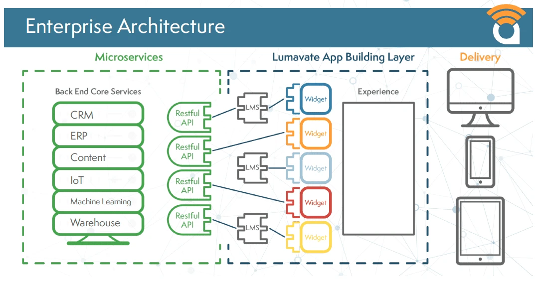
For enterprise organizations that have built access to their data using Restful APIs, the Lumavate Platform becomes a powerful tool to build applications that can use data in place, with code that is encapsulated and reusable. By using both Widgets and Microservice Widgets, a marketer can create complete applications that serve users across devices such as mobile, tablet, and desktop. Support for these different form factors is an important part in proliferating applications across the enterprise.
